Posts tagged with “ascii art”
Posted on . Filed in . Tagged with .

ASCII Art Used in Chain Mail Online

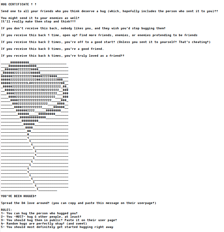
You can see an example of chain letter (chain mail) which uses ASCII art to illustrate and attract attention to it. I’ve seen others which use ASCII art angels and a large face with open arms on either side.

I’m not a fan of chain mail, even those which appear to be nice on the surface. How well meaning can they be when they are still based on telling people what they will or will not get if they do or do not send the chain letter to someone else. Often a lot of other people. Don’t consider yourself expected to send this to anyone.

Posted on . Filed in . Tagged with .

Passwords in ASCII Art

I haven’t thought about ASCII art text images being used for passwords in a long time. I remembered the idea when I read a post written by hackers who were trying to create software which would crack ASCII art passwords based on repeated characters.

ASCII art as a password is pretty unique still. Don’t worry too much about hackers cracking your password. Just make your ASCII art a bit more complicated, using more variety in the characters you choose and include numbers and letters too. Of course, the ASCII has to be one line too.

Think of it as a good reason to work on creating new one line ASCII art.

Posted on . Filed in . Tagged with .

Visual Poetry: Concrete Poetry and Calligrams

Concrete poetry is a form of text art, like ASCII art and typewriter art. It's also poetry, the genre known as visual poetry. Concrete poetry uses words and drawings to illustrate a poem. The words are in the image. The text itself forms a visible picture on the page, like a silhouette.

Calligram seems to be another word for concrete poetry. If there is a distinction between them I'm not sure what it is. Maybe calligrams are more about graphic art based visual poetry and concrete poetry is more text based. However they began the line between the two has become blurred.

You know concrete poetry when you see it because the word has become the art, the illustration and the picture holds the words inside it.

Sometimes the poem is written in a shape which can be read in different ways but still make sense. For example, a circle which can be read in any direction.

Concrete poets use use typography: fonts, shape, texture, colour, and sometimes animation to form text art into prose.

Concrete Poetry/ Calligram History

Simmias of Rhodes, a 4th century scholar and poet, created poems written in shapes relevant to the subject.

In the Middle Ages when Monks used concrete poetry to illuminate their written text.

Guillaume Apollinaire (Picasso's friend) composed several calligrams.

How to Critique of Calligrams/ Concrete Poetry

Is it easy to identify the picture with the text?

Is the image relevant to the poem?

Does the image add something (humour, deeper meaning, comprehension) to the poem?

Can the poem stand on it's own as just a poem?

Does the text help form the image, does the text actually add something to the image?

Are there alternative ways of reading the poem?

Try Creating your own Concrete Poem

Get a general idea of something you could write about. Pick a topic or idea which creates images and thoughts in your mind right away.

Draw a sketch (like an outline) of the idea. Even if you want to work with ASCII art or typewriter art you sitll need a basic sketch to start with). Imagine yourself as a cartoonist who just has one panel, one image, to tell the story or explain the idea.

Write your poem, get the words at the end of each line to rhyme. Keep it short and keep it simple for your first try visual poetry work. Aim for a total of four rhyming lines.

Take your poem and fit it into your sketch. How do the words add to the sketch? Once you get this far you might change your mind about the sketch and draw it differently or start all over fresh, with a different vision for the image you use with your words.

Go from there and turn your sketch into text art and then type in your words. This adds another challenge as you will have limits imposed by the typewriter or word processing text itself. A hand drawn concrete poem can be moved in any way your hand chooses to draw it. If you create ASCII art, you will (hopefully) enjoy the challenge of concrete poetry and ASCII art.

Concrete Poetry: Artists and Links
Posted on . Filed in . Tagged with .

Descriptive ASCII Art – Word Play in Text

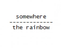
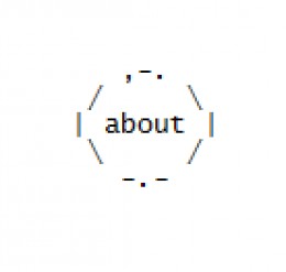
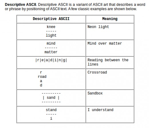
Rebus Puzzles, Wordies, Visual Puns, Pictogram Puzzles and Descriptive ASCII

I’ve seen this kind of insight puzzle several times over the years but if I knew the correct name for it I had forgotten. They are called Rebus Puzzles, also known as Wordies. In searching for more of these online I have found them called a variety of names: visual puns, pictogram puzzles and Descriptive ASCII. When people don’t know the name, they come up with something themselves. I like ‘visual pun’ it makes sense.

Some puzzles are straight forward text (like those I’ve added below). Others include pictures and symbols too. There’s probably confusion about describing these styles and labeling them all with the same name.

If you get brain strained and want a different kind of word game, try BookWorm.

Adding a New Element to ASCII Art

I like the idea of taking this a step farther as an ASCII art element. I’ve been working on ideas to create wordie puzzles (without pictures, just in text). They are a new element to add to text art. Kind of puzzling…

So far I find I am only thinking along the lines of puzzles which include directional words like “above, over, under, beside”. I think I can take the text puzzles farther once I wrap my mind around the idea of keeping them typed out rather than using graphic software which would let me move the words around the final image.

Maybe no one will understand what I’m talking about there. But, I do and it’s kind of a cool project for “someday”.

Posted on . Filed in . Tagged with .

Japanese ASCII Text Art: Shift JIS

I used to label all the Japanese ASCII art as ANSI art and just click on by. It was a snobby attitude, but I was trying to keep the standards of ASCII art – which is so often confused or cheated on with ANSI art and assorted other versions of text art which don’t stick to the standard keyboard characters, no frills.

Since my early days as an ASCII artist I have learned the Japanese ASCII art is not ANSI art, it really is in a category of it’s own. But, there is an element of ANSI (using every and any keyboard character) thrown in.

SJIS is Japanese ASCII Art

Japanese ASCII art images are created from characters within the Shift JIS character set, intended for Japanese usage. So, Japanese ASCII art is usually called Shift JIS, abbreviated to SJIS or AA, meaning ASCII art. However, it’s not typical/ standard ASCII art because it uses characters outside of those standard for ASCII text art.

Shift JIS uses not only the ASCII character set, but also Japanese characters such as Kanji. Since there are thousands of Japanese characters, the images have more variety to them. However, they need to be viewed in the right font.

Unlike traditional ASCII art (which works best with a monospaced font) Shift JIS art is designed around the proportional-width MS PGothic font supplied with Microsoft Windows. However, many characters used in Shift JIS art are the same width. This led to the development of the free Mona Font where each character is the same width as its counterpart in MS PGothic.

SIJS art, like ANSI art and sometimes ASCII art, can be used to create animated text images using Adobe Flash files and animated GIFs. Shift_JIS has become popular and has even made its way into mainstream media and commercial advertising in Japan.

Mona Font is the Japanese proportional font used to view Japanese text art.